
DIGITAL IDENTITY / WEB DESIGN
STUDIO PROJECTAtelier Rouge
A cosmetics house imagined as a complete digital world. Portraits, colour and texture start the conversation; collections, shades, rituals and editorial content turn it into a considered shopping experience.
An independent AsturaWeb exploration. Digital experience design, rather than a client commission.
- INDUSTRY
- Beauty · E-commerce · Editorial direction
- WEBSITE LANGUAGE
- French
- EDITION
- 2026
- SCOPE
- Identity, UI and production direction
01 / THE CONTEXT
Desire begins with an image. Buying needs a clear path.
Atelier Rouge is an independent beauty concept with a Parisian sensibility. The proposal connects an aspirational brand with its operations: presenting products, explaining variants, guiding choices and preparing campaigns within one system.
- Collections, shades, finishes and saved items
- Rituals, campaigns and journal linked to the catalogue
- Orders, shade inventory and editorial publishing
The artwork keeps its original language. The case study follows your chosen AsturaWeb language.
02 / THE CHALLENGE
Keep the intensity of a beauty campaign without hiding what people need to buy. Shade, finish, application and delivery must be as clear as the imagery is memorable.
THE IDEA
Burgundy, ivory and black. A high-contrast serif gives the brand its voice; a precise grid organises the catalogue. Close-ups, pigments and objects alternate with readable content and recognisable actions.
03 / BEYOND THE HOMEPAGE
A complete system,
beyond the first screen.
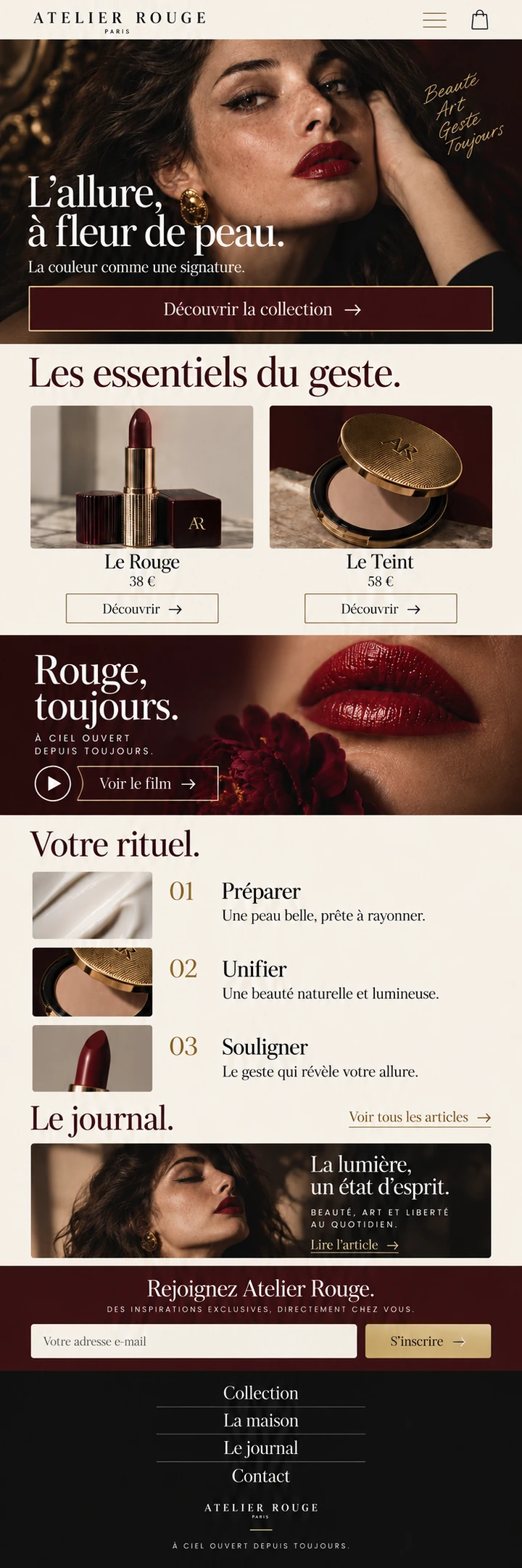
The homepage brings together campaign, collection, ritual and journal. Each entry leads to a different decision: explore a finish, choose a shade, learn a technique or return to saved items. The content strategy connects these entry points to specific products.
THE PROJECT’S VISUAL LANGUAGE
Character, with purpose.
Colour & material
Deep burgundy · ivory · warm black
Typography & hierarchy
An expressive serif for campaigns and stories; discreet labels and a stable hierarchy for choosing and buying.
Imagery & motion
Close portraits and large-scale textures. The motion direction proposes brief fades and changes of framing; still imagery conveys that intent without loading autoplay video.
DESIRE, WITH THE DETAILS
One collection.
Many ways to choose.
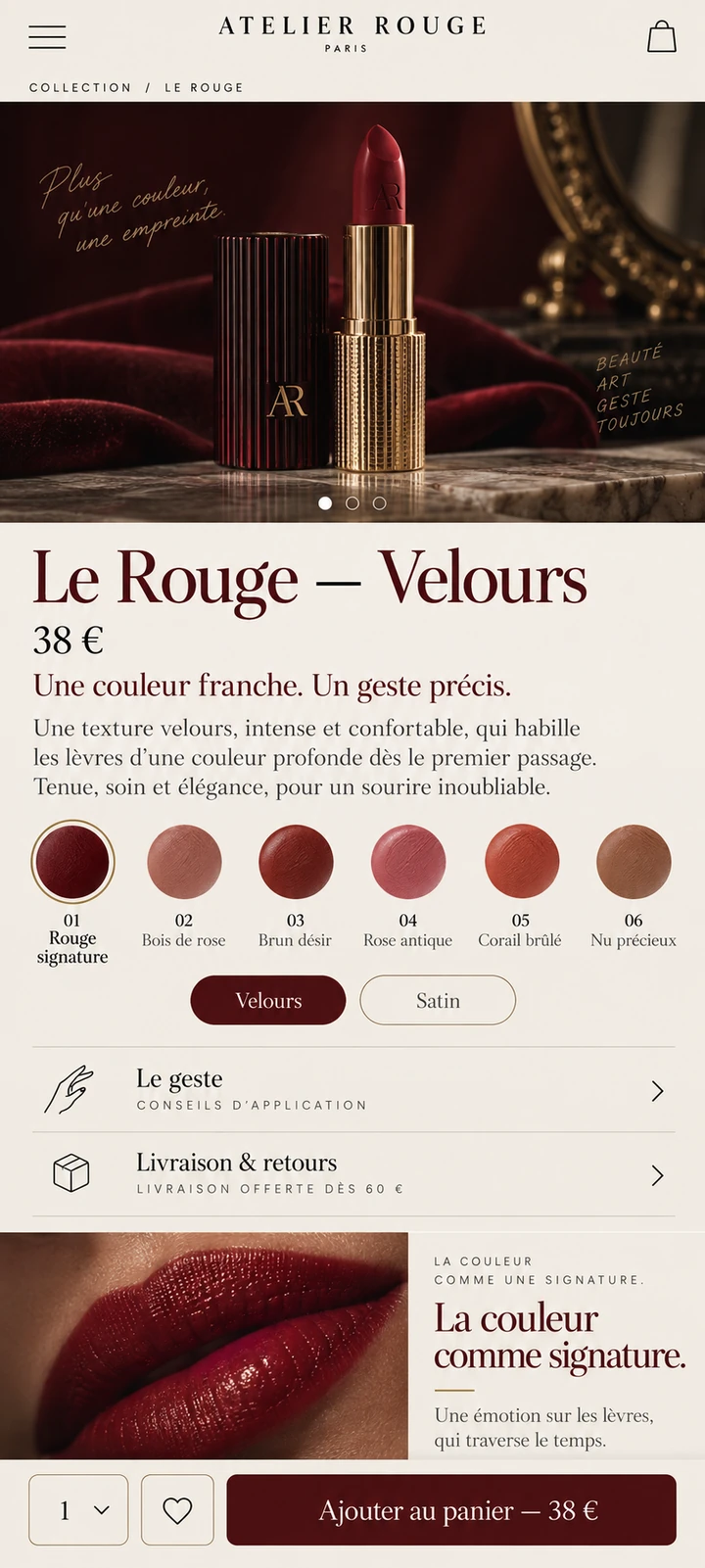
The catalogue makes product families and finishes easy to compare. Each detail page brings texture closer, names every shade and gathers application, delivery and the next step. Recommendations support a choice without turning the page into an endless shop window.
FROM CHOICE TO ORDER
The bag keeps product, shade, quantity and total together. Delivery and payment are clearly defined steps; account and saved items let people pick up where they left off.
04 / RESPONSIVE & INTERACTION
Another screen.
The same intention.
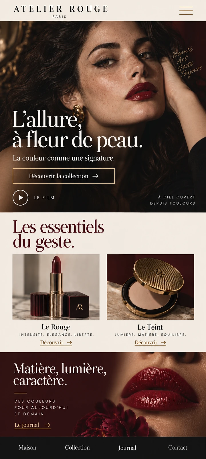
The long homepage scrolls inside a realistically proportioned phone. Two further screens show a brand overview and a product detail. Navigation becomes compact; shades, price and the purchase action retain their priority.
CONTENT THAT OPENS NEW PATHS
The image draws you in.
The story guides you.
Campaign, journal and ritual serve different purposes. Campaigns build identity; the journal encourages discovery; rituals explain how to combine products. Shared catalogue references keep inspiration and shopping connected.
INTERACTION DIRECTION
Galleries that preserve focus, shade selection with visible names and short transitions between chapters. Motion supports reading and is reduced when the visitor prefers it.
BEHIND THE CAMPAIGN
An expressive brand.
A system to support it.
The workspace connects references, shades and stock with orders, launches and content. Draft, review and published states separate preparation from the moment a campaign reaches its audience.
Proposed management interface for the concept. Orders and quantities illustrate tasks, not real trading activity.
- 01Prepare
Product, variants, images and terms in one shared record.
- 02Connect
Link products to rituals, articles and campaigns.
- 03Review and publish
Check availability, content and permissions before launch.
FROM BRIEF TO SYSTEM
- 01Context
- 02Content
- 03Structure
- 04Visual direction
- 05UI system
- 06Responsive
Development, integrations and production validation belong to a later phase, defined around the actual scope.
05 / TECHNICAL DIRECTION
Designed with
production in mind.
A recommended implementation for this concept, not a claim about an already built or deployed website.
Production could combine React and TypeScript with Shopify for products, variants, stock, orders and hosted checkout. A CMS would structure campaigns, articles and rituals linked to catalogue references. The workspace would need role-based permissions, previews and publishing checks. These interfaces define proposed journeys; they do not represent a connected shop or real sales.
- React
- TypeScript
- Shopify / Commerce API
- CMS
- WebP / AVIF
- Semantic HTML, keyboard access and contrast
- Responsive images and progressive loading
- Indexable content and SEO structure
Hosting, consent-based measurement and structured data would be defined around verified information and practical needs.
LET’S TALK
A new website, a redesign or an idea you haven't quite worked out yet. Write to us and we’ll explore what makes sense together.
Tell us
what you have in mind.
Shape my project
Based in Asturias. Working remotely across Spain, Europe and worldwide.
You don't need technical knowledge or a fully formed plan. Tell us what you do and what you’d like to improve. We’ll start there.
A tailored quote. A clear proposal, with no obligation.
TO GET THE CONVERSATION STARTED
- What your business does
- What you’d like to improve
- Your current website, if you have one