
DIGITAL IDENTITY / WEB DESIGN
STUDIO PROJECTFuera de Ruta
A small-capacity campsite for people looking for trees, fresh air and a simple stay. The concept presents pitches and cabins without turning them into a resort: landscape opens the experience, but practical conditions matter as much as emotion.
An independent AsturaWeb exploration. Digital experience design, rather than a client commission.
- INDUSTRY
- Camping · Hospitality · Stay selection
- WEBSITE LANGUAGE
- Spanish
- EDITION
- 2026
- SCOPE
- Identity, UI and production direction
01 / THE CONTEXT
Choosing a place, with your feet on the ground.
Fuera de Ruta addresses couples and small groups comparing ways to sleep before choosing dates. The proposal brings accommodation, terrain and visit preparation together. Photographs show damp grass, shadows and used materials; they promise neither perfect nature nor a real location.
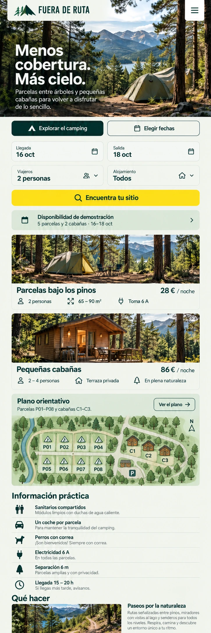
- Dates, guests and accommodation at first glance
- Schematic map with practical information for every pitch
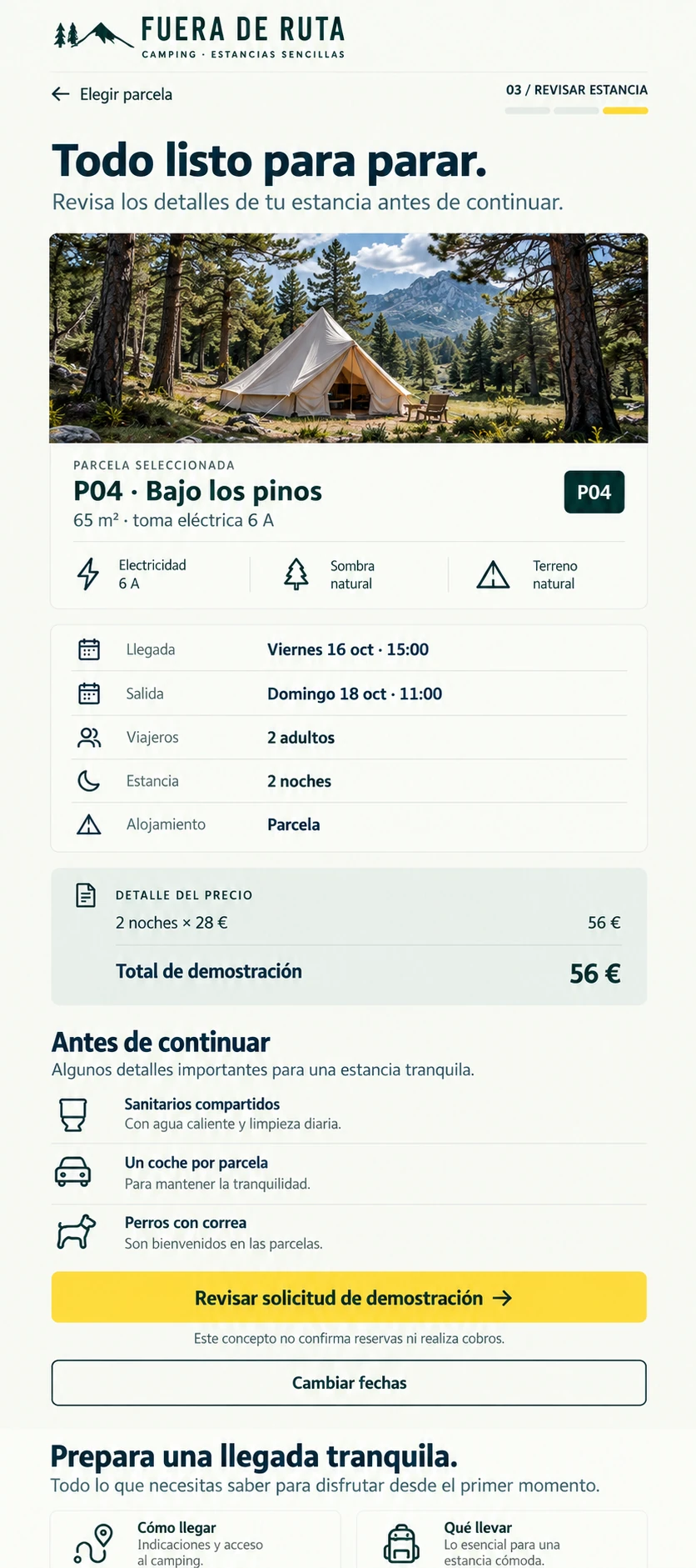
- Stay summary without real booking or payment
The artwork keeps its original language. The case study follows your chosen AsturaWeb language.
02 / THE CHALLENGE
An attractive photograph does not explain where to park, whether electricity is available or how far one pitch sits from the next. The challenge was to make those answers visible before asking for a booking, without turning the homepage into an administrative form.
THE IDEA
Pine green organises the wayfinding, mist white supports reading and yellow marks the next decision. A humanist sans keeps the tone approachable; compact numbers distinguish pitches and cabins. The map is explicitly schematic: it helps compare positions without pretending to be real geography.
03 / BEYOND THE HOMEPAGE
A complete system,
beyond the first screen.
Navigation beneath the landscape leads to the place, accommodation, activities and preparation. Dates and guests appear immediately. In the second view, selecting P04 connects an area on the map with its size, shade, power supply and distance to facilities. The summary retains that pitch, two guests and two nights: each amount can be traced through to the demonstration total.
THE PROJECT’S VISUAL LANGUAGE
Character, with purpose.
Colour & material
Pine for orientation, mist for reading, slate for data and yellow for choosing. Colour distinguishes functions without turning every block into a card.
Typography & hierarchy
Humanist lettering accompanies the landscape; pitch indices use a more compact register, useful when relating the map to its details.
Imagery & motion
A damp morning and an open tent in close-up. Photography connects the landscape with the everyday act of preparing a stay.
04 / RESPONSIVE & INTERACTION
Another screen.
The same intention.
On mobile, exploring and choosing dates remain separate actions. The form becomes short rows; prices and equipment stay beside each accommodation image. The summary orders arrival, departure, guests and conditions before the action. Long images scroll inside the shared phone, without shrinking a desktop composition.
FROM BRIEF TO SYSTEM
- 01Context
- 02Content
- 03Structure
- 04Visual direction
- 05UI system
- 06Responsive
Development, integrations and production validation belong to a later phase, defined around the actual scope.
05 / TECHNICAL DIRECTION
Designed with
production in mind.
Conceptual visual study: photographs and interface images generated and selected for the project. The depicted websites are not connected to live services.
Visual study with complete interfaces presented as images. Dates, prices and availability are demonstrations; no inventory, payments or booking service is connected. The portfolio provides real enlargement, keyboard access and mobile scrolling.
- Art direction
- Interface design
- Responsive WebP
- Semantic HTML, keyboard access and contrast
- Responsive images and progressive loading
- Indexable content and SEO structure
Hosting, consent-based measurement and structured data would be defined around verified information and practical needs.
LET’S TALK
A new website, a redesign or an idea you haven't quite worked out yet. Write to us and we’ll explore what makes sense together.
Tell us
what you have in mind.
Shape my project
Based in Asturias. Working remotely across Spain, Europe and worldwide.
You don't need technical knowledge or a fully formed plan. Tell us what you do and what you’d like to improve. We’ll start there.
A tailored quote. A clear proposal, with no obligation.
TO GET THE CONVERSATION STARTED
- What your business does
- What you’d like to improve
- Your current website, if you have one