
DIGITAL IDENTITY / WEB DESIGN
STUDIO PROJECTPeau Libre
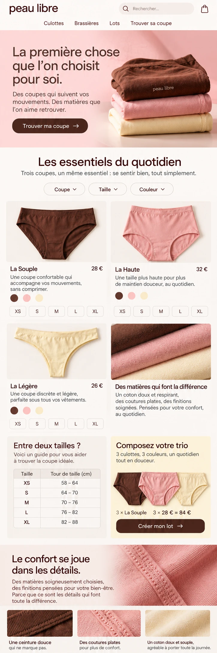
A conceptual everyday essentials brand that approaches desirability through movement and touch. Peau Libre proposes a calm purchase: recognise a cut, compare sizes and build a set without letting photography replace useful product information.
An independent AsturaWeb exploration. Digital experience design, rather than a client commission.
- INDUSTRY
- Everyday lingerie · E-commerce · Product selection
- WEBSITE LANGUAGE
- French
- EDITION
- 2026
- SCOPE
- Identity, UI and production direction
01 / THE CONTEXT
Softness can also be precise.
The audience wants pieces worth wearing every day, not an occasion campaign. The identity combines powder pink, cocoa and butter yellow. An adult in a simple outfit introduces a natural attitude; textile details bring the conversation closer to seams, shapes and finishes.
- Brand and collection navigation on two levels
- Size, colour and cut alongside the product decision
- Three-piece bundle with consistent choices and totals
The artwork keeps its original language. The case study follows your chosen AsturaWeb language.
02 / THE CHALLENGE
Choosing lingerie online involves small but decisive questions: waist height, coverage, size and colour. The design needed to make these comparable without medical claims, invented certifications or a promise of universal fit.
THE IDEA
Two navigation levels separate search, account and basket functions from collections. An asymmetric diptych places photography beside a specific cut, with a name, price and variants. Rounded typography adds warmth, while the rhythm of labels and tables avoids a childish expression.
03 / BEYOND THE HOMEPAGE
A complete system,
beyond the first screen.
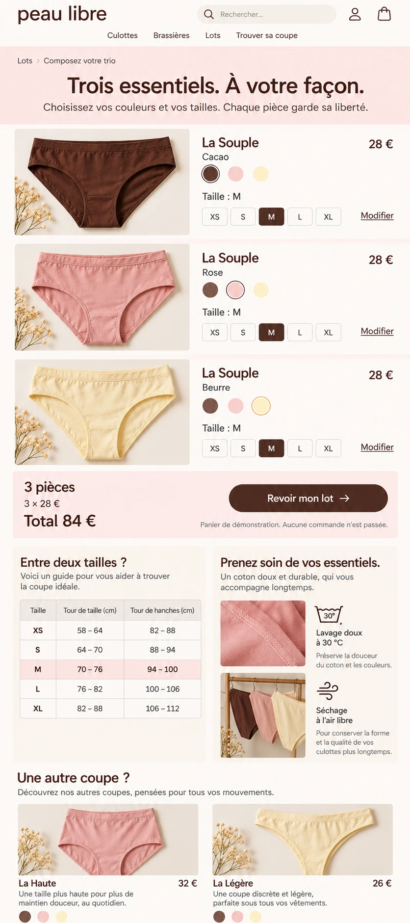
The collection leads to La Souple, a product retaining its name, colour and price across views. Its page brings together selected size, colour swatches, measurement guidance and care. The mobile bundle keeps three pieces of this cut: cocoa, rose and butter. The summary explains every choice before displaying the total, without fictitious discounts or manufactured urgency.
THE PROJECT’S VISUAL LANGUAGE
Character, with purpose.
Colour & material
Cocoa provides contrast; pink presents the collection and butter highlights guidance. Softness does not reduce legibility.
Typography & hierarchy
A gently curved sans organises headings and products. Editorial accents stay within the narrative, without reproducing Atelier Rouge’s cosmetics language.
Imagery & motion
Diffuse light, close textiles and natural gestures. Photography supports an everyday identity without turning the body into a provocative selling point.
04 / RESPONSIVE & INTERACTION
Another screen.
The same intention.
Categories become a readable horizontal rail. Products occupy two columns, with variants close to their names; size guidance joins the journey instead of interrupting it. The bundle uses independent rows, so checking or changing a piece does not require decoding a tiny mosaic.
FROM BRIEF TO SYSTEM
- 01Context
- 02Content
- 03Structure
- 04Visual direction
- 05UI system
- 06Responsive
Development, integrations and production validation belong to a later phase, defined around the actual scope.
05 / TECHNICAL DIRECTION
Designed with
production in mind.
Conceptual visual study: photographs and interface images generated and selected for the project. The depicted websites are not connected to live services.
Catalogue and selection concept represented through interface images. Products, sizes and prices are illustrative; no orders or payments are processed. No manufacturing origin, certification or unverified benefit is attributed to the brand.
- Art direction
- Interface design
- Responsive WebP
- Semantic HTML, keyboard access and contrast
- Responsive images and progressive loading
- Indexable content and SEO structure
Hosting, consent-based measurement and structured data would be defined around verified information and practical needs.
LET’S TALK
A new website, a redesign or an idea you haven't quite worked out yet. Write to us and we’ll explore what makes sense together.
Tell us
what you have in mind.
Shape my project
Based in Asturias. Working remotely across Spain, Europe and worldwide.
You don't need technical knowledge or a fully formed plan. Tell us what you do and what you’d like to improve. We’ll start there.
A tailored quote. A clear proposal, with no obligation.
TO GET THE CONVERSATION STARTED
- What your business does
- What you’d like to improve
- Your current website, if you have one