
DIGITAL IDENTITY / WEB DESIGN
STUDIO PROJECTOdd Frequency
A small conceptual family of desktop electronic instruments. Odd Frequency addresses musicians and curious makers who want to explore through physical controls. The site brings the object closer, explains its connections and leaves space for experimentation without looking like a productivity app.
An independent AsturaWeb exploration. Digital experience design, rather than a client commission.
- INDUSTRY
- Electronic instruments · Product · Sound exploration
- WEBSITE LANGUAGE
- English
- EDITION
- 2026
- SCOPE
- Identity, UI and production direction
01 / THE CONTEXT
Sound begins in your hands.
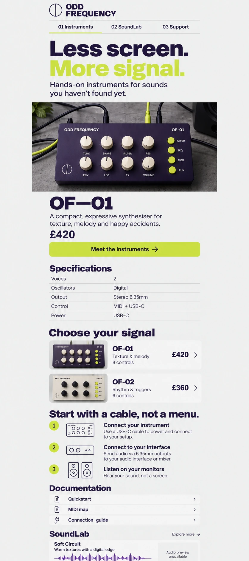
The proposal starts with a compact synthesizer: violet metal, light knobs and yellow signals. The product should read as an instrument rather than a mysterious box. Studio photography, consistent nomenclature and documentation accompany a direct voice: less screen, more signal.
- Instrument and specifications in distinct columns
- Model comparison with consistent terminology
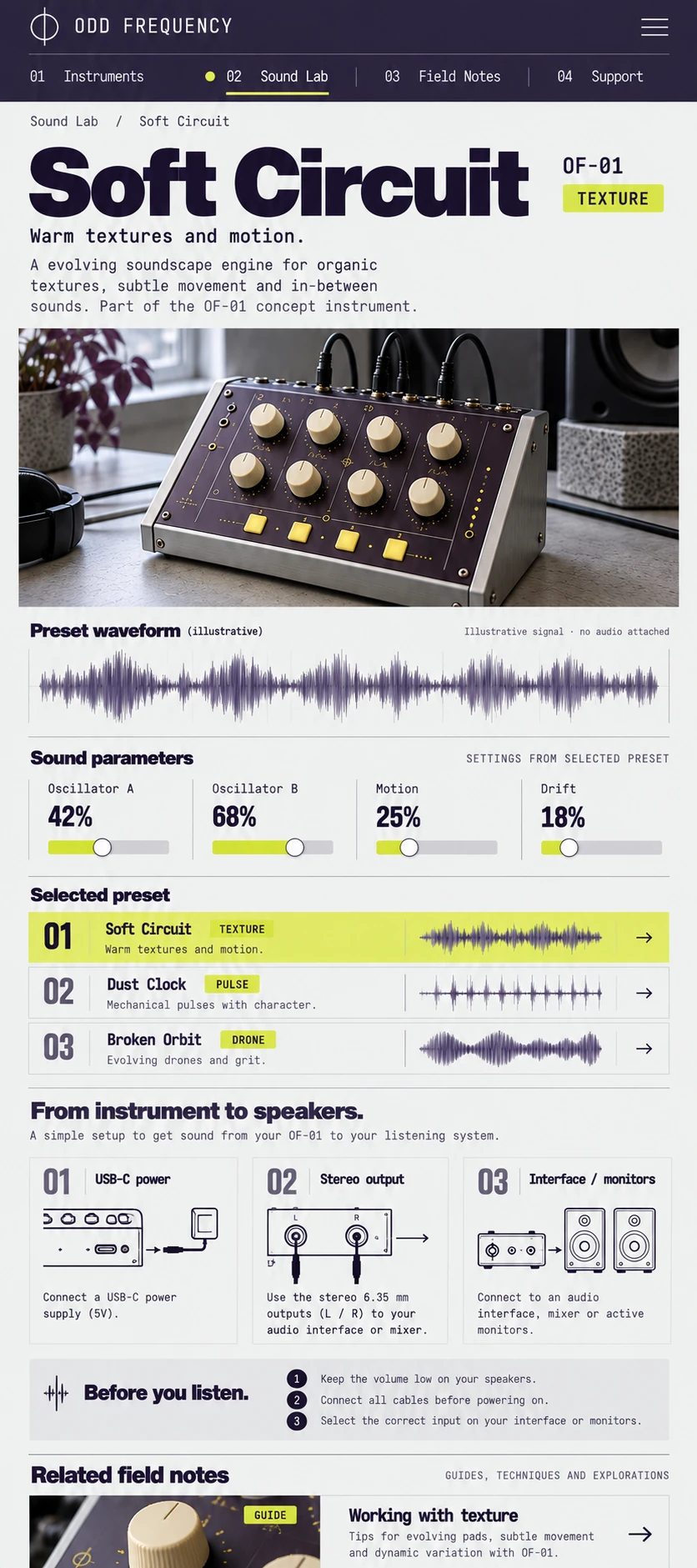
- Sound Lab clearly states that audio is unavailable
The artwork keeps its original language. The case study follows your chosen AsturaWeb language.
02 / THE CHALLENGE
An experimental brand needs to invite curiosity without hiding its limits. The challenge was to separate expression from technical information: images communicate scale and touch; data columns let visitors check controls, connections and possibilities without searching promotional paragraphs.
THE IDEA
A numbered vertical rail organises instruments, Sound Lab, notes and support. Light grey suggests a workbench, violet provides structure and yellow identifies actions. Compact grotesque headings contrast with monospaced data, like two registers on the same physical panel.
03 / BEYOND THE HOMEPAGE
A complete system,
beyond the first screen.
The homepage places an instrument opposite its specifications. The following comparison distinguishes OF-01 and OF-02 by purpose, controls and outputs. Sound Lab groups presets by name, character and signal path. Waveforms are visual notation; listening is marked unavailable because this concept contains no audio files. Nonexistent playback is never presented as functional.
THE PROJECT’S VISUAL LANGUAGE
Character, with purpose.
Colour & material
Ink violet and workshop grey, with acid yellow limited to signals. Industrial precision replaces gaming-style gradients.
Typography & hierarchy
Compact grotesque for models and headings; monospace for ports, parameters and indices. The distinction separates exploration from reference information.
Imagery & motion
An instrument on a table, restrained cables and close metal details. Photography connects specifications with recognisable material decisions.
04 / RESPONSIVE & INTERACTION
Another screen.
The same intention.
The side index becomes a numbered horizontal selector. The mobile product view prioritises image, model, connectivity and documentation; specifications remain rows rather than a reduced wide table. The second view develops one preset and its connection guide, preserving context before any control.
FROM BRIEF TO SYSTEM
- 01Context
- 02Content
- 03Structure
- 04Visual direction
- 05UI system
- 06Responsive
Development, integrations and production validation belong to a later phase, defined around the actual scope.
05 / TECHNICAL DIRECTION
Designed with
production in mind.
Conceptual visual study: photographs and interface images generated and selected for the project. The depicted websites are not connected to live services.
Fictional product family and documentation, presented as interface images. No manufactured devices, shop or audio engine are connected. Image enlargement and phone exploration reuse AsturaWeb’s actual components.
- Art direction
- Interface design
- Responsive WebP
- Semantic HTML, keyboard access and contrast
- Responsive images and progressive loading
- Indexable content and SEO structure
Hosting, consent-based measurement and structured data would be defined around verified information and practical needs.
LET’S TALK
A new website, a redesign or an idea you haven't quite worked out yet. Write to us and we’ll explore what makes sense together.
Tell us
what you have in mind.
Shape my project
Based in Asturias. Working remotely across Spain, Europe and worldwide.
You don't need technical knowledge or a fully formed plan. Tell us what you do and what you’d like to improve. We’ll start there.
A tailored quote. A clear proposal, with no obligation.
TO GET THE CONVERSATION STARTED
- What your business does
- What you’d like to improve
- Your current website, if you have one