
DIGITAL IDENTITY / WEB DESIGN
STUDIO PROJECTPli Commun
A conceptual workshop for contemporary bookbinding, restoration and small editions. Pli Commun addresses people wishing to preserve a book, make a notebook or produce a series. The site translates paper, thread and gesture into editorial reading without turning the screen into a three-dimensional book.
An independent AsturaWeb exploration. Digital experience design, rather than a client commission.
- INDUSTRY
- Bookbinding · Craft · Project enquiry
- WEBSITE LANGUAGE
- French
- EDITION
- 2026
- SCOPE
- Identity, UI and production direction
01 / THE CONTEXT
A craft expressed through composition.
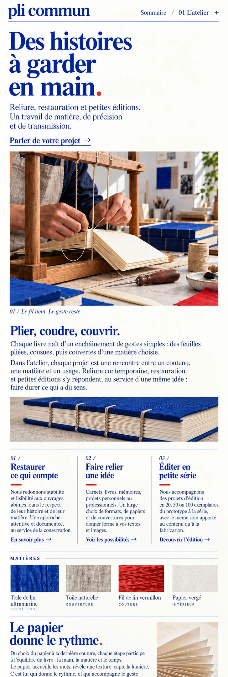
The proposal presents a living, graphic and precise craft. Paper white and ultramarine organise the document; vermilion marks an annotation or decision. Images show tools and material work, away from beige nostalgia or a purely decorative craft symbol.
- Editorial composition with marginal contents
- Materials and formats connected to the object’s use
- Commission-led enquiry instead of standard checkout
The artwork keeps its original language. The case study follows your chosen AsturaWeb language.
02 / THE CHALLENGE
A binding commission cannot be chosen like a standard product. A book’s condition, intended use, format and quantity change the conversation. The design needed to show concrete possibilities and lead to a short enquiry, without promising an instant quote or guaranteed restoration.
THE IDEA
The homepage works as a flat editorial spread: offset headings, varied image proportions and useful captions. A numbered contents list occupies the right margin. Reading typography carries the narrative while sober annotations recall a workshop document, without imitating a conventional commercial interface.
03 / BEYOND THE HOMEPAGE
A complete system,
beyond the first screen.
Services, workshop studies, materials and process connect within one document. The custom-binding page distinguishes format, paper, cloth and stitching. Ultramarine, linen and vermilion return as recognisable samples. The enquiry first asks whether the need is restoring a book, making a notebook or producing a small edition, then gathers enough context to begin a conversation.
THE PROJECT’S VISUAL LANGUAGE
Character, with purpose.
Colour & material
Paper white and ultramarine establish the graphic voice. Vermilion appears in small signals, like a correction mark or visible thread.
Typography & hierarchy
Serif typography supports reading; sans labels organise techniques, materials and folios. Their contrast builds a document, not a nostalgic set.
Imagery & motion
Tools, signatures, cloth and stitching. Close framing explains the craft without inventing client commissions or restoration results.
04 / RESPONSIVE & INTERACTION
Another screen.
The same intention.
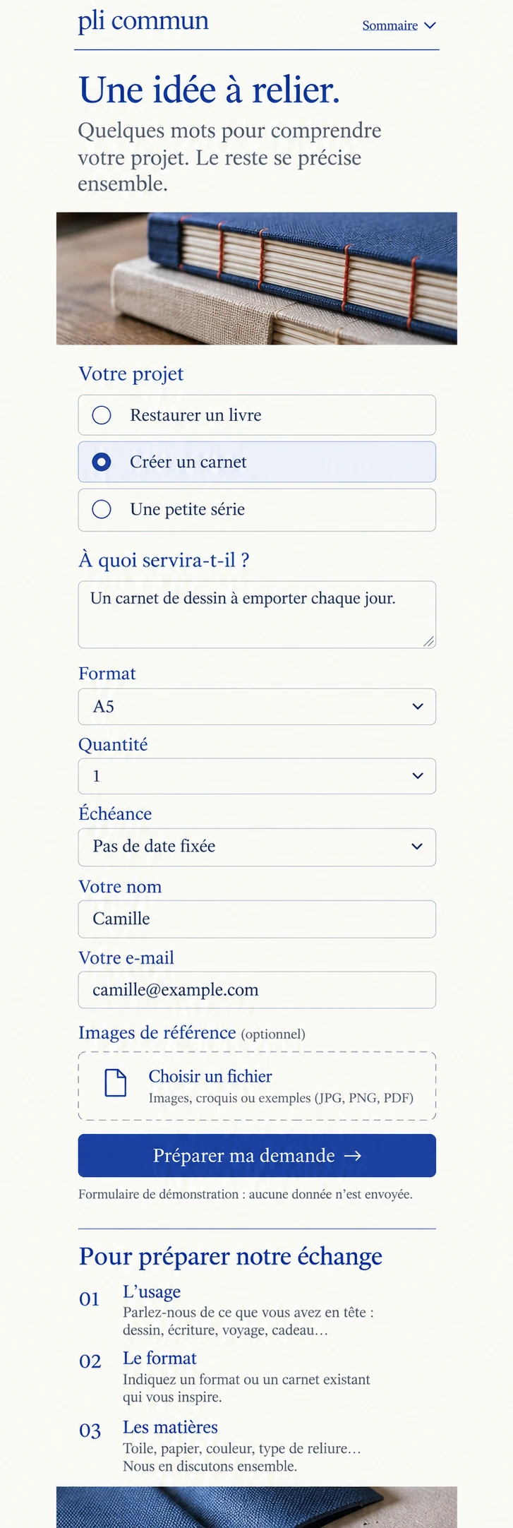
Contents become an expandable element within the reading flow. Chapters retain captions and vertical continuity instead of becoming an endless stack of cards. The mobile enquiry separates need, description and contact, without a lengthy form or a basket implying a fixed final price.
FROM BRIEF TO SYSTEM
- 01Context
- 02Content
- 03Structure
- 04Visual direction
- 05UI system
- 06Responsive
Development, integrations and production validation belong to a later phase, defined around the actual scope.
05 / TECHNICAL DIRECTION
Designed with
production in mind.
Conceptual visual study: photographs and interface images generated and selected for the project. The depicted websites are not connected to live services.
Identity and enquiry study represented through images. Work is conceptual, with no claimed client commissions. The illustrated form sends no data or files; a real project would require examining the object and agreeing its scope.
- Art direction
- Interface design
- Responsive WebP
- Semantic HTML, keyboard access and contrast
- Responsive images and progressive loading
- Indexable content and SEO structure
Hosting, consent-based measurement and structured data would be defined around verified information and practical needs.
LET’S TALK
A new website, a redesign or an idea you haven't quite worked out yet. Write to us and we’ll explore what makes sense together.
Tell us
what you have in mind.
Shape my project
Based in Asturias. Working remotely across Spain, Europe and worldwide.
You don't need technical knowledge or a fully formed plan. Tell us what you do and what you’d like to improve. We’ll start there.
A tailored quote. A clear proposal, with no obligation.
TO GET THE CONVERSATION STARTED
- What your business does
- What you’d like to improve
- Your current website, if you have one