
DIGITAL IDENTITY / WEB DESIGN
STUDIO PROJECTAfterlight Cinema
A conceptual independent cinema for people who enjoy choosing a screening and staying for the credits. Afterlight Cinema is conceived as a cultural place, not a streaming platform. The programme, times and practical decisions dominate from the first glance.
An independent AsturaWeb exploration. Digital experience design, rather than a client commission.
- INDUSTRY
- Independent cinema · Programme · Screening selection
- WEBSITE LANGUAGE
- English
- EDITION
- 2026
- SCOPE
- Identity, UI and production direction
01 / THE CONTEXT
The next screening before the next slogan.
The brand brings discoveries, seasons and gatherings together around fictional films. Midnight blue supports the identity; turquoise illuminates reading and dates; ticket red marks selection. Photography conveys the venue’s scale without inventing an address or an existing programme.
- Day-based programme with immediately visible times
- Consistent film, screening and room across views
- Seat selection and totals clearly marked as demonstrations
The artwork keeps its original language. The case study follows your chosen AsturaWeb language.
02 / THE CHALLENGE
Some visitors arrive knowing which film they want to see; others want to discover something. The design needed to serve both. Placing times before long descriptions allows a quick screening choice, while posters and short notes maintain a cultural entry into the programme.
THE IDEA
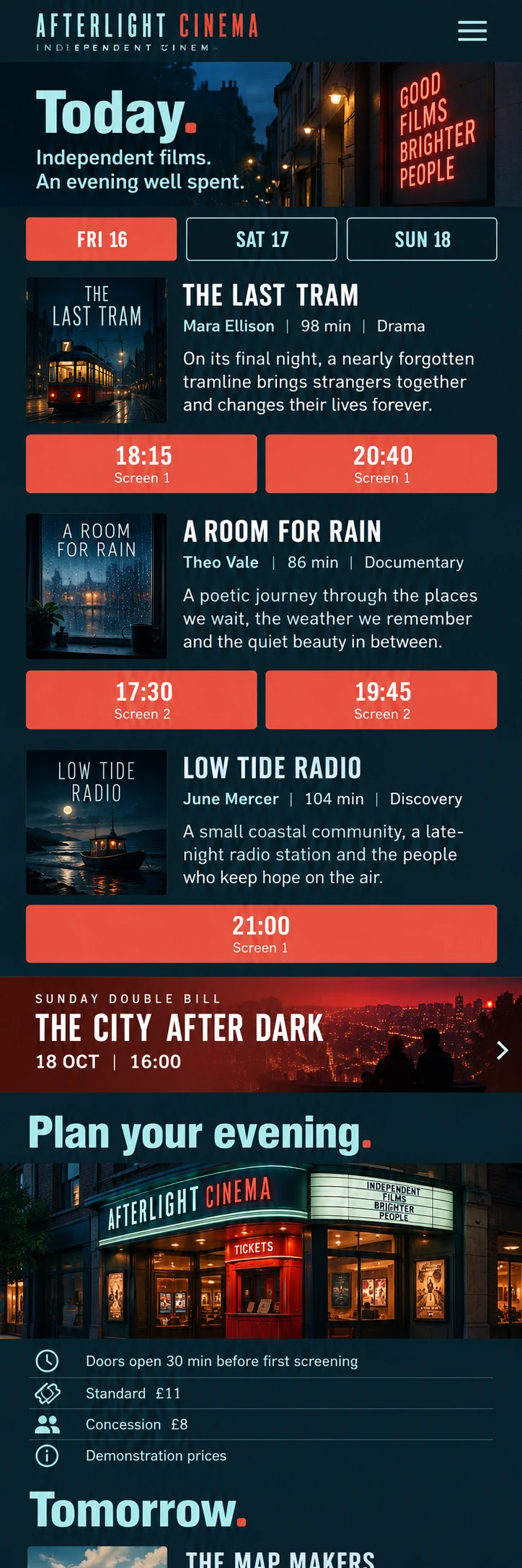
The typographic header recalls a cinema sign, then makes room for a day selector. Each film occupies a row with poster, context and times, rather than a streaming catalogue card. Condensed headings accommodate expressive names; screening times retain consistent size and contrast.
03 / BEYOND THE HOMEPAGE
A complete system,
beyond the first screen.
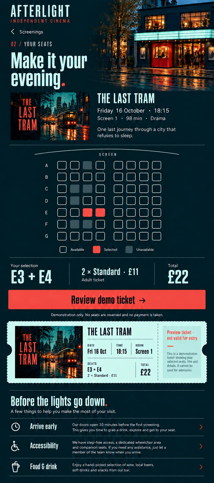
Today gathers the day’s screenings, with date changes organising exploration. The Last Tram returns on its detail page with duration, programme notes and consistent times. Mobile seat selection retains film, time and screen before choosing two seats. The total separates quantity and amount; the journey is explicitly a demonstration and never produces a valid ticket.
THE PROJECT’S VISUAL LANGUAGE
Character, with purpose.
Colour & material
Midnight blue, pale turquoise and ticket red. Accents serve dates and selections instead of making every poster compete for attention.
Typography & hierarchy
Condensed film and programme headings, large times and compact secondary data. The hierarchy supports decisions before reading the complete synopsis.
Imagery & motion
A facade at dusk and a cinema interior detail. Posters and films belong to the concept’s fictional world rather than borrowing a real programme.
04 / RESPONSIVE & INTERACTION
Another screen.
The same intention.
On phones, Today and available times come first. Posters take less space without losing recognition; screening buttons keep useful touch areas. The seating view organises rows, availability and selection with a nearby legend, avoiding reliance on colour alone.
FROM BRIEF TO SYSTEM
- 01Context
- 02Content
- 03Structure
- 04Visual direction
- 05UI system
- 06Responsive
Development, integrations and production validation belong to a later phase, defined around the actual scope.
05 / TECHNICAL DIRECTION
Designed with
production in mind.
Conceptual visual study: photographs and interface images generated and selected for the project. The depicted websites are not connected to live services.
Programme and ticketing design presented as interface images. Films, screenings, room and prices are fictional. No sales, payments or seat reservations take place; the portfolio provides its shared controls for examining each screen.
- Art direction
- Interface design
- Responsive WebP
- Semantic HTML, keyboard access and contrast
- Responsive images and progressive loading
- Indexable content and SEO structure
Hosting, consent-based measurement and structured data would be defined around verified information and practical needs.
LET’S TALK
A new website, a redesign or an idea you haven't quite worked out yet. Write to us and we’ll explore what makes sense together.
Tell us
what you have in mind.
Shape my project
Based in Asturias. Working remotely across Spain, Europe and worldwide.
You don't need technical knowledge or a fully formed plan. Tell us what you do and what you’d like to improve. We’ll start there.
A tailored quote. A clear proposal, with no obligation.
TO GET THE CONVERSATION STARTED
- What your business does
- What you’d like to improve
- Your current website, if you have one